Fanart: Link
Um Fanarts bewerten zu können, musst du dich einloggen
| FenGirl [Zeichner-Galerie] | Upload: 15.03.2006 12:53 |
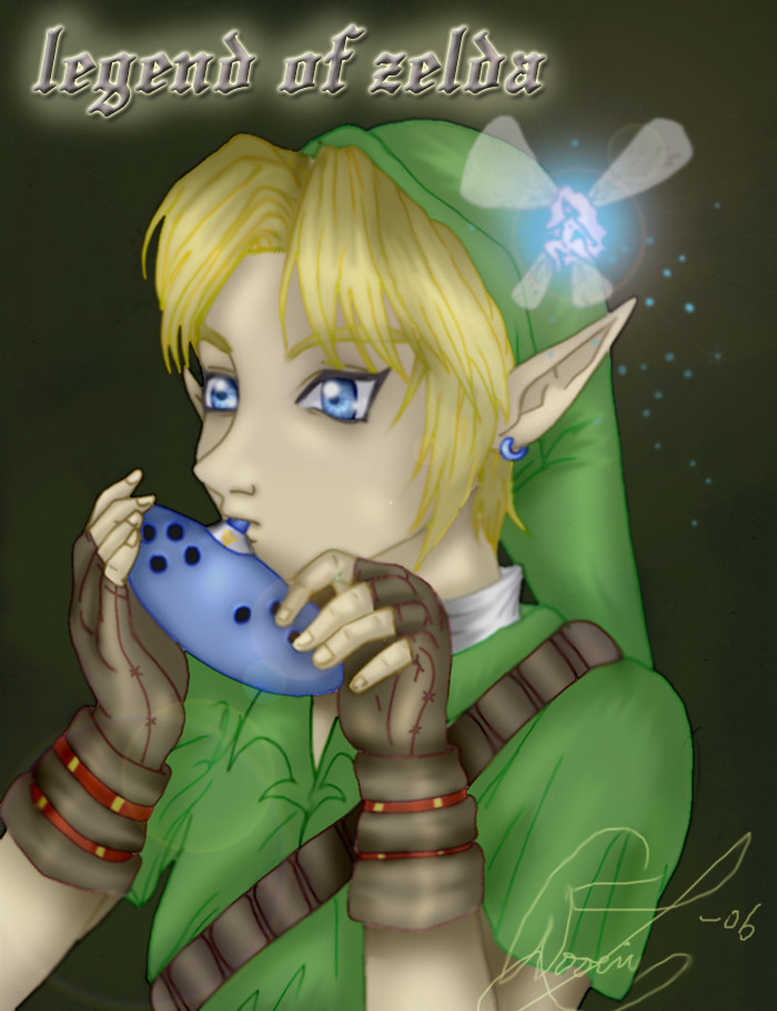
| link and navi playing write in englis pliase! |
Themen: The Legend of Zelda Stile: Computer koloriert |
| Beschwerde |
Kommentare (6)
how sweet!
that´s really cool!
and btw you´re a really gut painter/drwaer!
yr pics are really amazing!
that´s really cool!
and btw you´re a really gut painter/drwaer!
yr pics are really amazing!
Von: abgemeldet
13.04.2006 19:44
geil...
GOLDENEN DAUMEN!!!!!!!!! -.-
GOLDENEN DAUMEN!!!!!!!!! -.-
Von: abgemeldet
25.03.2006 20:22
Häftigt!
It's sooooooooooo coooool! *Swenglish* ^^
min favorit!!
It's sooooooooooo coooool! *Swenglish* ^^
min favorit!!
Wow, what a nice coloration!! *_____* Are you intersted in participate at one of my contests? Dead-line is in June, but I also would give more time if needed ;3
http://animexx.4players.de/fanarts/wettbewerbe_alt/?doc_modus=detail&id=18511
http://animexx.4players.de/fanarts/wettbewerbe_alt/?doc_modus=detail&id=18279
http://animexx.4players.de/fanarts/wettbewerbe_alt/?doc_modus=detail&id=18498
http://animexx.4players.de/fanarts/wettbewerbe_alt/?doc_modus=detail&id=18511
http://animexx.4players.de/fanarts/wettbewerbe_alt/?doc_modus=detail&id=18279
http://animexx.4players.de/fanarts/wettbewerbe_alt/?doc_modus=detail&id=18498
Von: abgemeldet
15.03.2006 14:05
Okay, ignore my grammar and spelling mistakes. ^.^
At first, your artwork is great. You did a great job on the atmosphere and Links tunica is well colored.
There's one thing still bothering me. His gloves and his hair, I think the contrast is too strong. Not between hair and gloves of course... ^^°
Maybe for the red-brown "lines" on the gloves, you should have taken a colour which is more similar to the brown you took for the lether. It's the same thing conserning his hair. Maybe a soft contrast would have been better.
Please don't take my comment too serious. It's an advice, I didn't want to sound mean ^^°
baba
~Farkas
wow!
I like it!
I like it!
